This blog is a long one and discusses my project of 3 paintings of Paris in various styles based on French artistic tradition, primarily from the 19th and 20th centuries. I put dates next to each segment of the process to show when things took place progress wise and to show how my thought process changed over time.
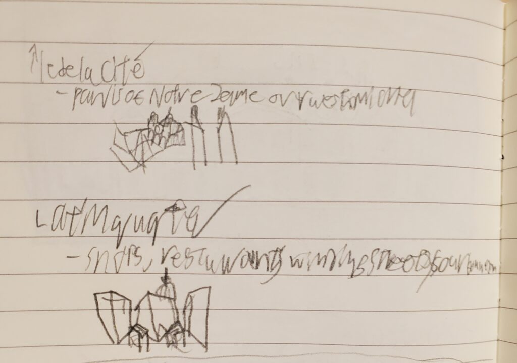
8/1-9/2023: I made a list of a few sites I would like to portray and attributes if each of them I would like to try to include. For example, the Latin Quarter has winding streets, is filled with shops and restaurants with diverse qualities (stores range from knick-knacks to local markets and restaurants range from fast food and bars to fine dining with a bar), and it’s local landmarks like Sourbonne, the Institut de France, and the Cluny. Ideally, I’d be able to do a series of paintings for each location, but I know my limits and will thus endeavor to fit as many as I can in one painting each.
8/10-13/2023: I have sketched out some drafts; first some rudimentary ideas of potential views, then more in depth plans to further define the direction I would like to go. Now I am in the process of selecting images to create the paintings which will either be done by painting a location exactly as it is in real life, or by using parts of the images to synthesize a view to distill the essence of the location.
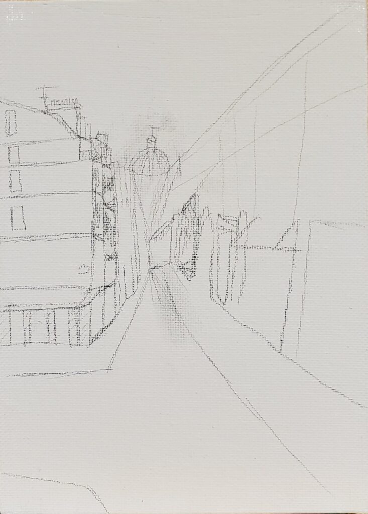
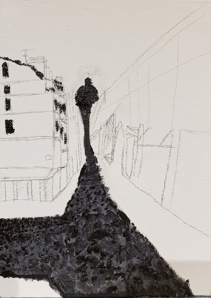
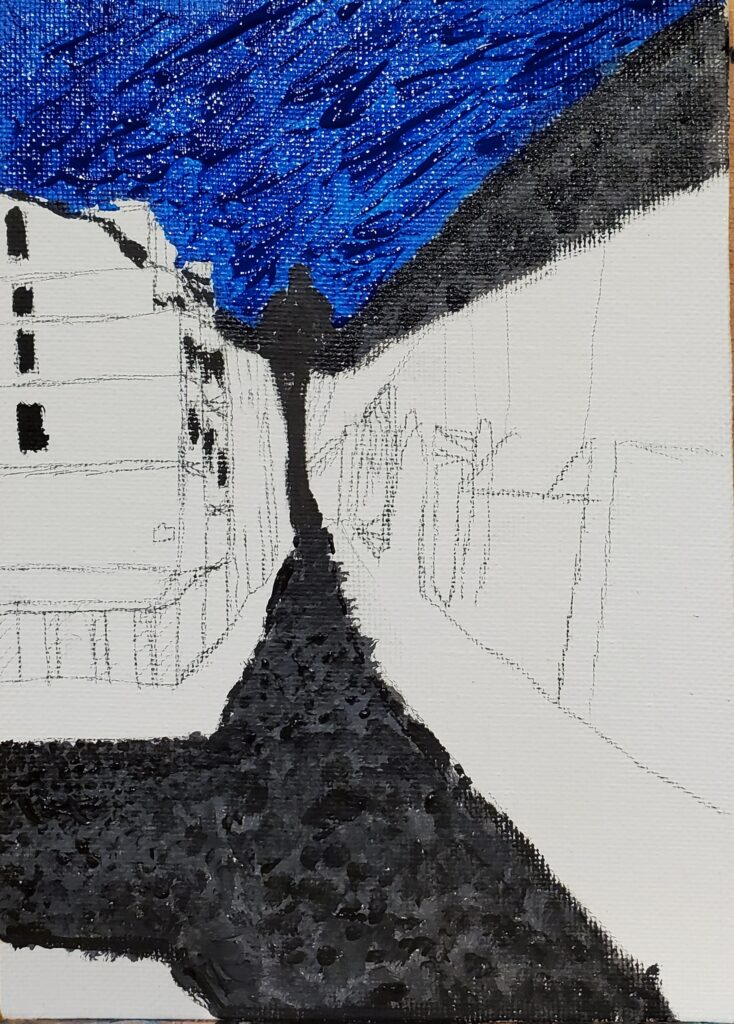
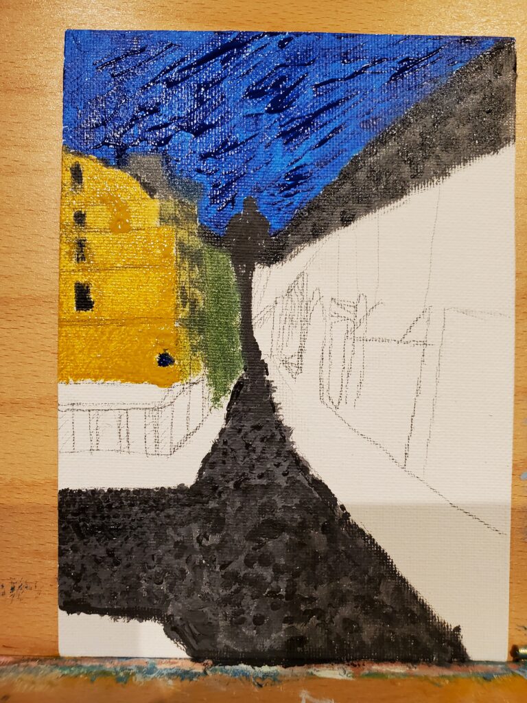
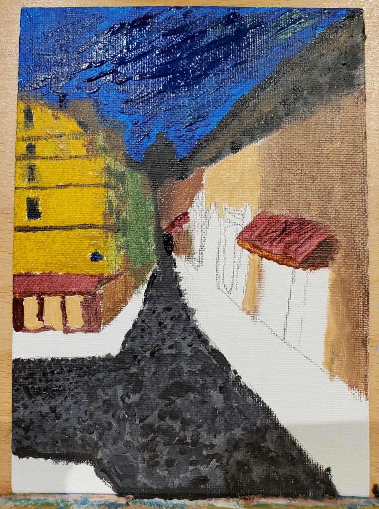
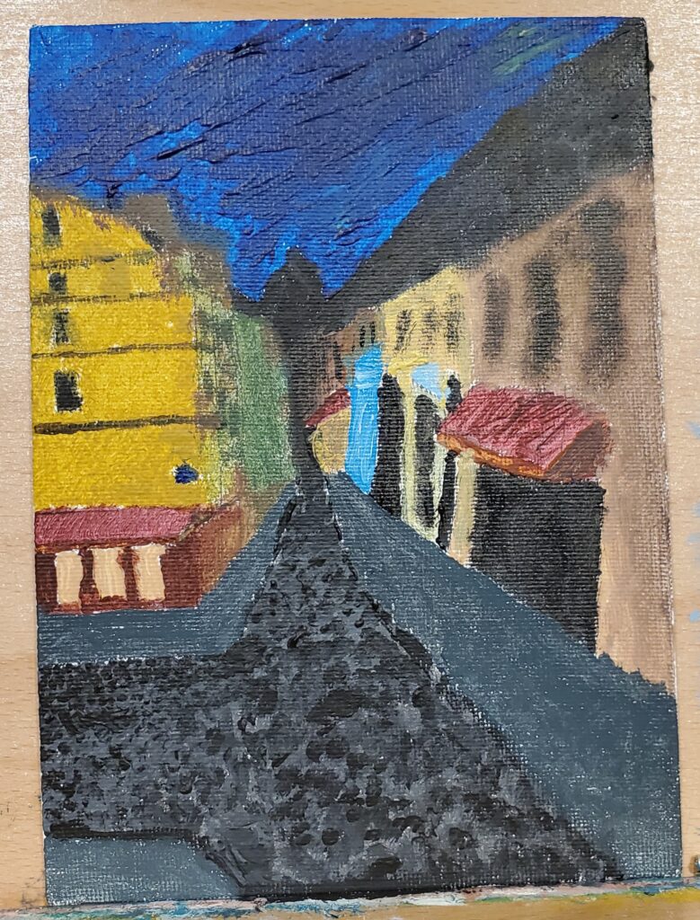
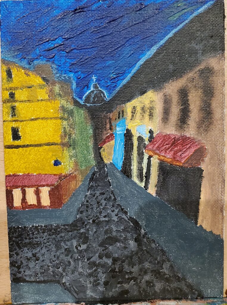
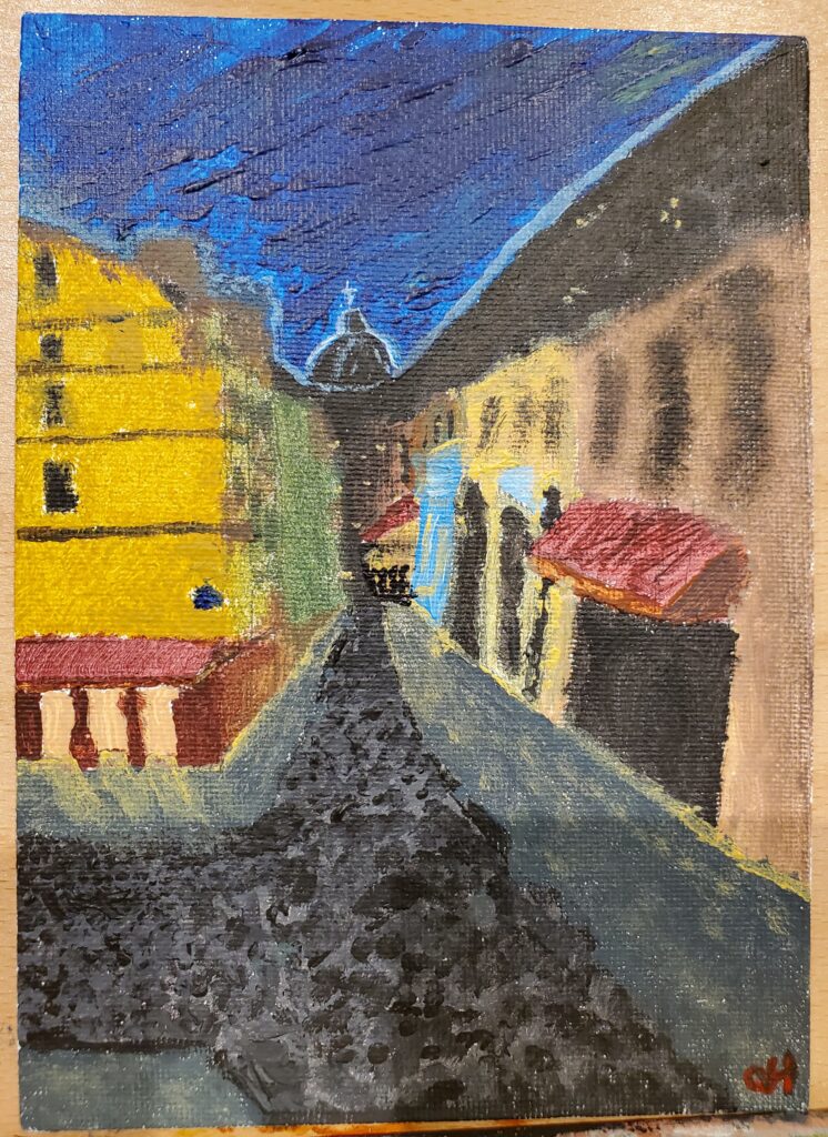
8/13-15/2023: I decided to start with the Latin Quarter since it required the least amount of image synthesis. I had selected a primary picture to act as the base of the painting and procured a few other sample pictures to better help with the colors, colors, details, and features I wanted to include in the painting that weren’t in the original image. I started by sketching out a skeleton onto the canvas before adding paint. I wanted to go for a post-impressionist style for this painting, particularly inspired by the “Café Terrace at Night” by Vincent van Gogh. I used acrylic paint which was unfortunately thinner than the oil paint of the time leading to a flatter texture and some bleeding issues, but I think the colors turned out alright considering the material limitations. I wanted to display storefronts, restaurants, and the geometric layout of streets to the best of my ability with the perspective I am using, as well as the dome of the Institut de France showing the area’s history with education.
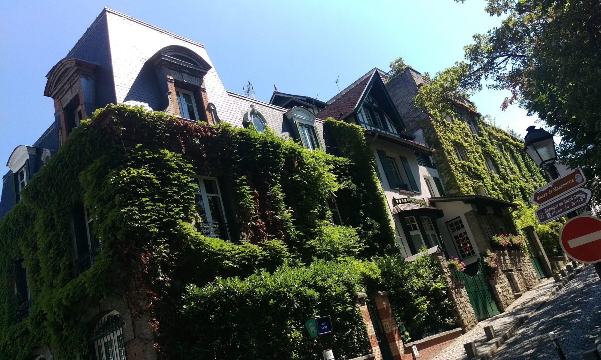
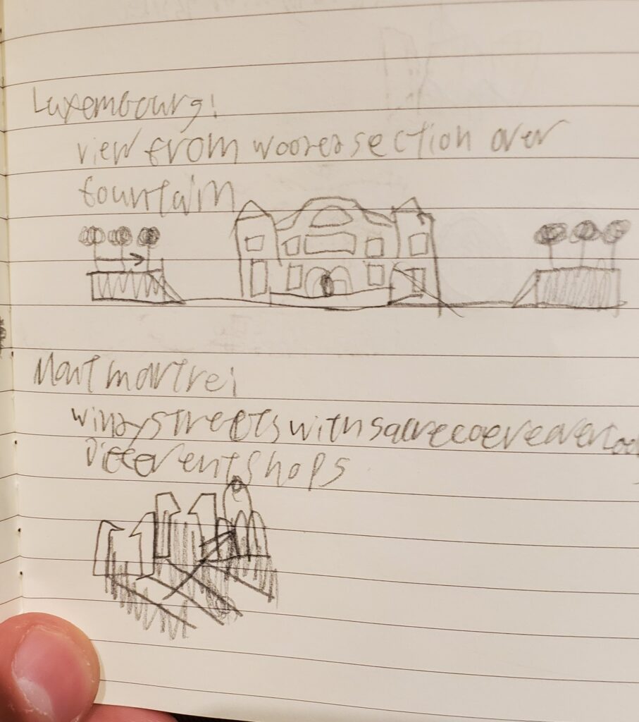
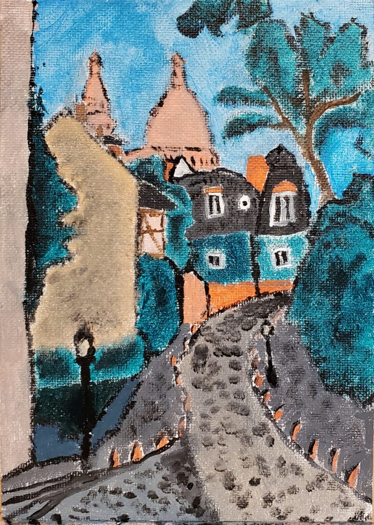
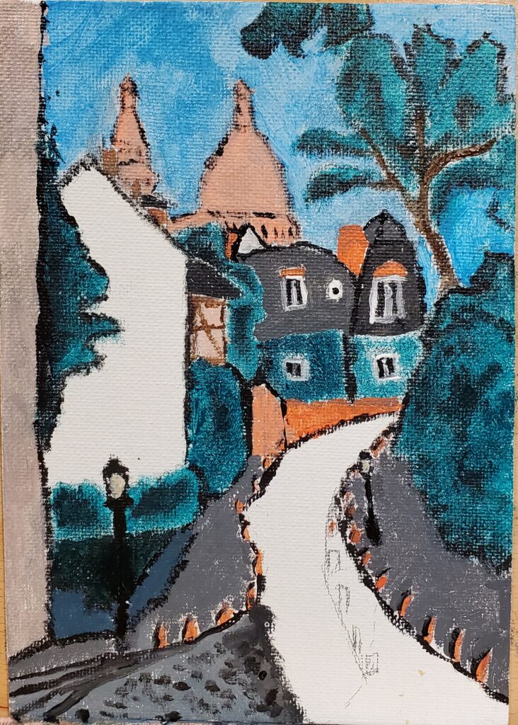
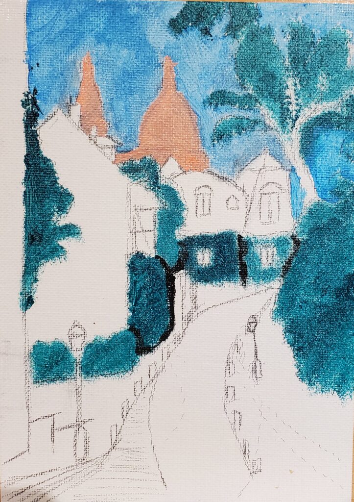
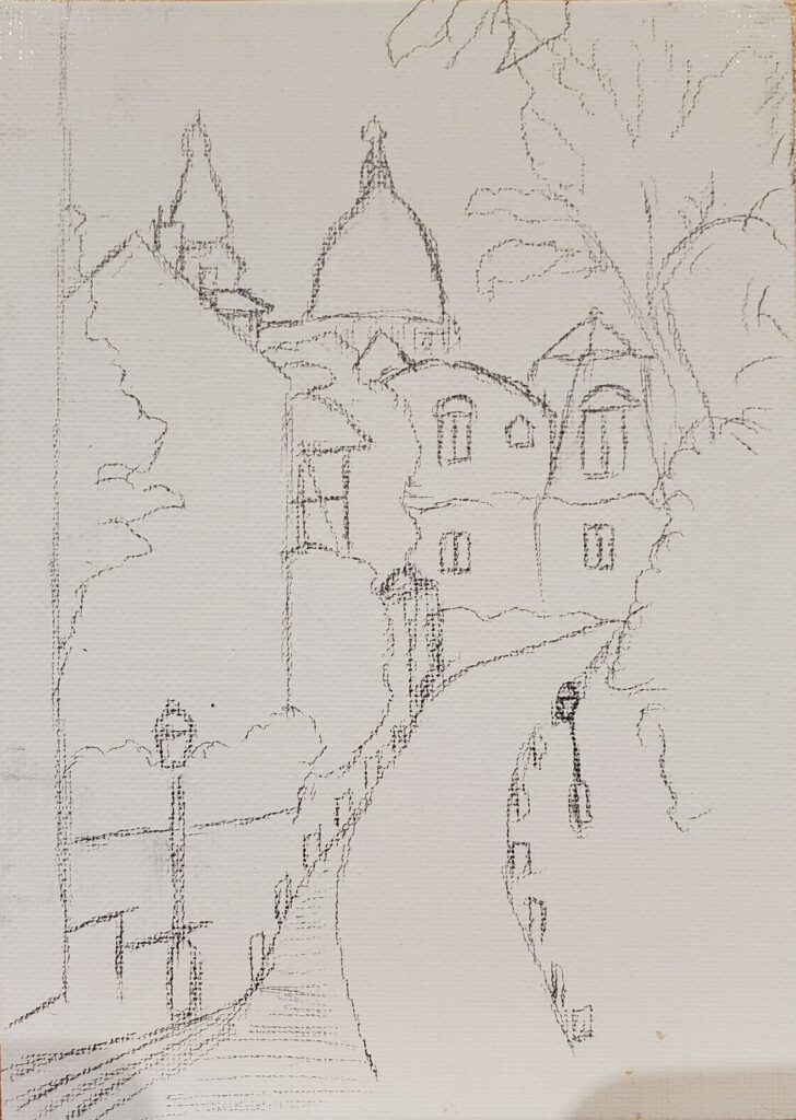
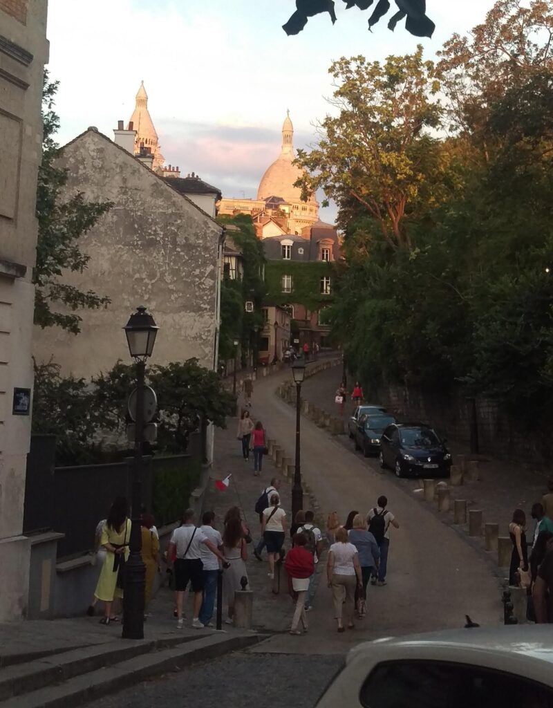
8/15/2023: I wanted to try different artistic styles for the remaining paintings to further show the diversity of French painting while trying to match the feel of the style with the subject. This in mind, picking a style for Montmartre was difficult because it was home to so many different artists. By the time I finished the Latin Quarter painting I narrowed it down to two styles: an impressionist/art-nouveau style like Toulouse-Lautrec or a Fauvist style like Matisse. I initially wanted to create and image that encompassed the whole of Montmartre from the base to the top, but I felt I couldn’t adequately do that while sticking to any kind of spatial reality. The image I decided to use in the end showed the windy streets, the varying architecture, the incline of the hill, and the crowning basilica of Sacre-Cœur at the top. Coincidentally, this is the same street that the picture used as the backdrop of this blog was taken from, (note the ivy covered building in the midground). thought is that I can add insinuations of what all occurs around Montmartre be it art, food, or other establishments with the buildings present in the image. This image in mind, I opted for a style more inspired by Matisse and got to work sketching a skeleton for the painting to follow. The style I’m leaning into for this particular painting has a very interesting use of color theory, particularly with the use of contrasting colors to make different parts of the images pop, that will be a challenge to work with. To accomplish this, I have been utilizing vibrant, often unmixed, paint in primary colors (only mixing to make colors like orange and pink), applying them in broad forms with varying concentration, adding shading and highlights afterward, and outlining some of the forms to further define some of the shapes. I used a painting of the Luxembourg Gardens by Matisse as a reference for color and shape for the painting. In retrospect, I could have used this as a reference for my painting of the Luxembourg Gardens, but integrity is important to me and I am not going to plagiarize Matisse. I decided to add a small, barely noticeable, “X” onto the “H” of my signature as a reference to a part of Montmartre I couldn’t quite portray in this vignette.
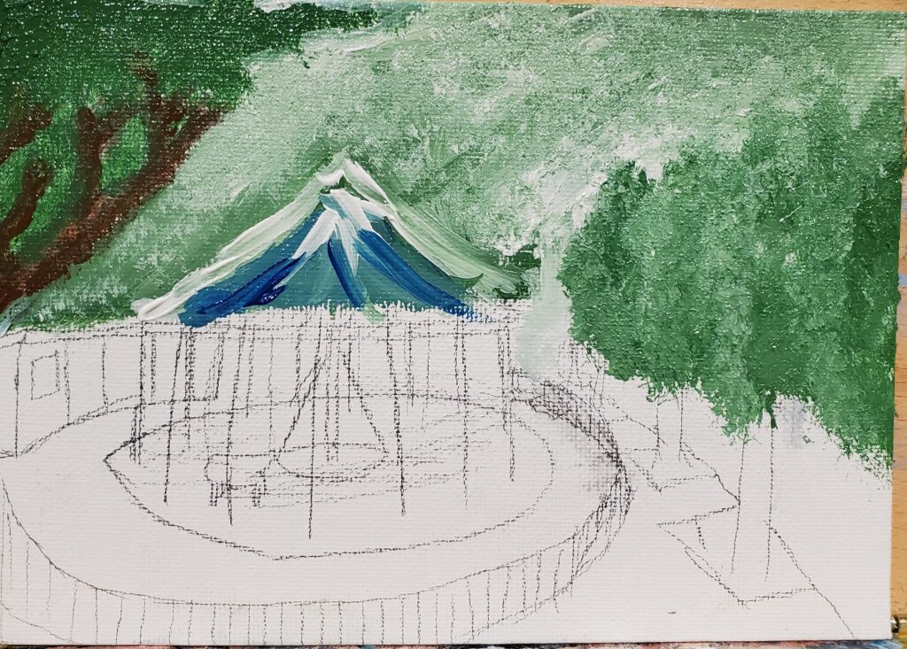
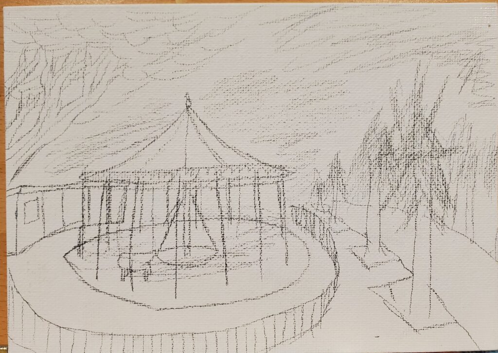
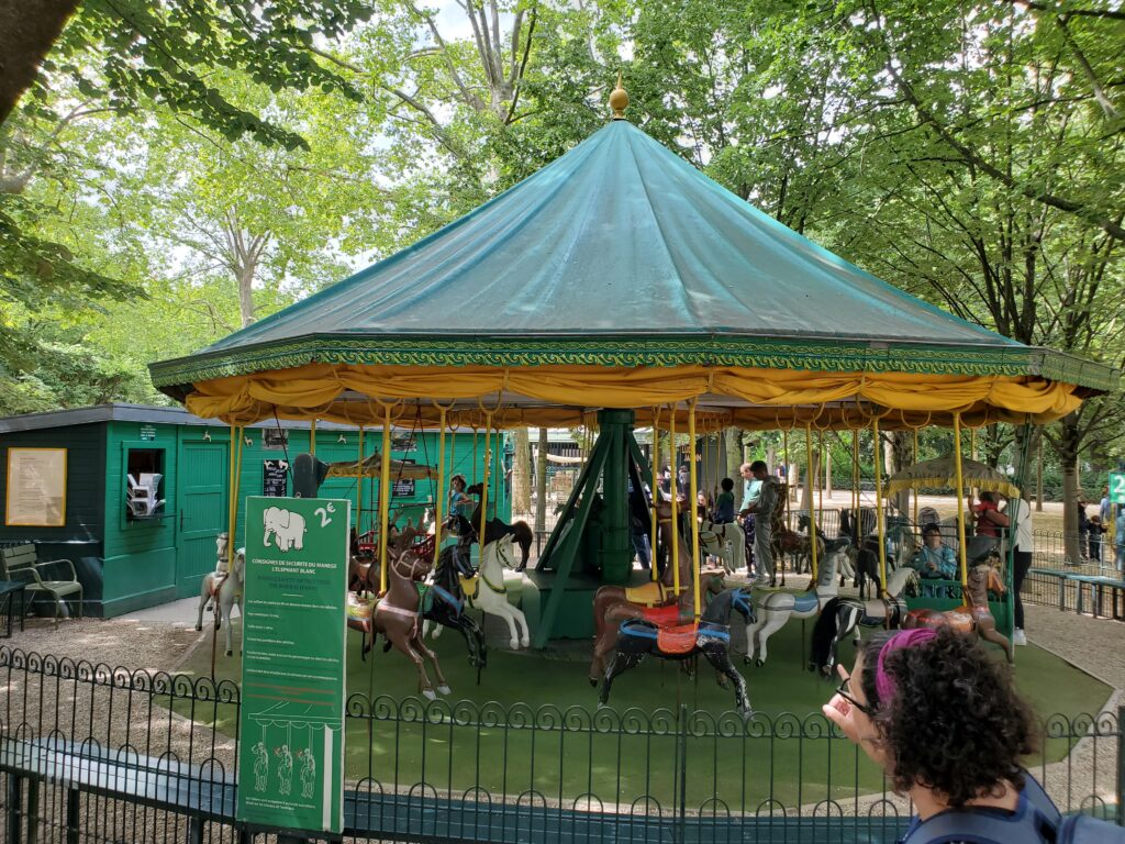
8/15-16/2023: For the Luxembourg gardens, I initially wanted to paint a view from western terrace down over the basin to the palace or a view of the terrace, but I couldn’t find an adequate picture of either to paint. I did however have a painting of the carousel with some of the surrounding garden around it. I decided to use it as a focus, along with some filling in of the terrace around it, to add to the movement of the picture. I chose a more Monet inspired style for the painting as I felt it lent a certain hazy feel that would work well with the mellow yet dynamic image I am trying to create. So, this all in mind, I got to work on sketching a skeleton and looked for aesthetic references that could help with color and texture.

8/17/2023These were all I could complete before the due time, and I am happy with the results. I might make more over the course of the semester, and if so I will share them. Thank you for the opportunity, and I hope you enjoyed!!!